How blind people identify paper money, and why US bills still don’t help
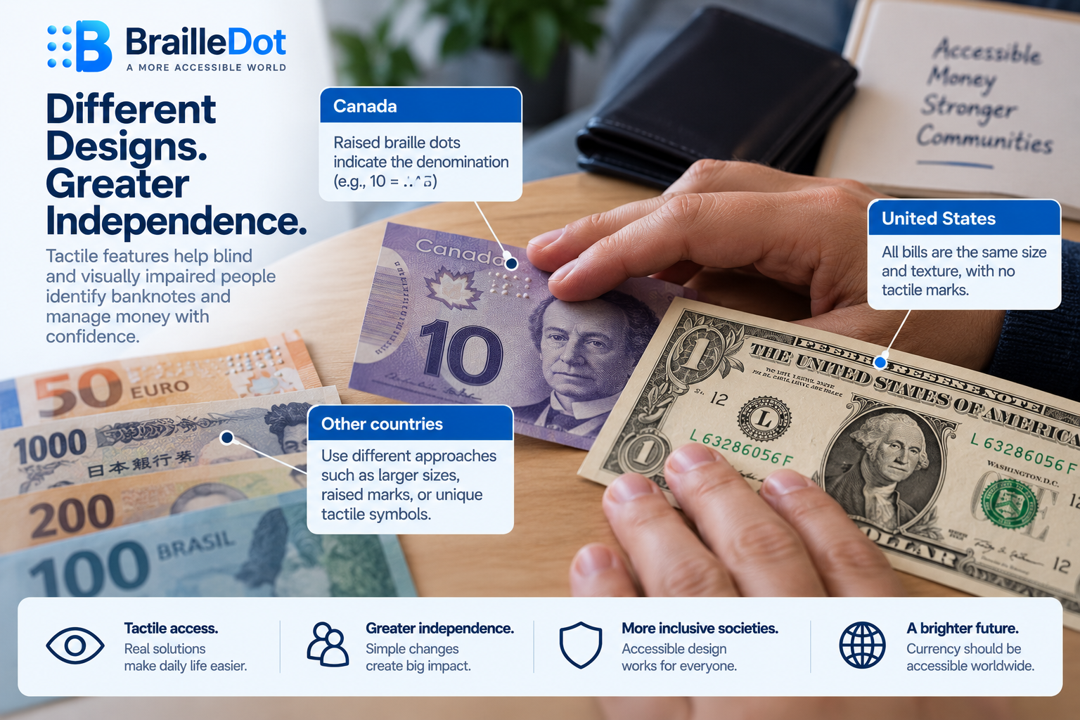
For decades, the US dollar and the Canadian dollar were the only 2 major world currencies whose bills didn’t vary in size by denomination at all. Every US bill, from a single dollar to a hundred, is the same size, the same shape, and the same texture, which means the most basic tool a blind person could use to sort currency by touch, size itself, simply isn’t available. Coins are a different story entirely, distinguishable by size, weight, and the ridged or smooth edges different denominations already carry, a problem that was effectively solved by ordinary coin design long before anyone raised it as an accessibility issue. Paper currency is where the real gap sits, and Canada eventually closed it. The United States, more than 60 years after the government first asked blind Americans for input on the problem, still hasn’t.
Canada’s solution has actual braille on it
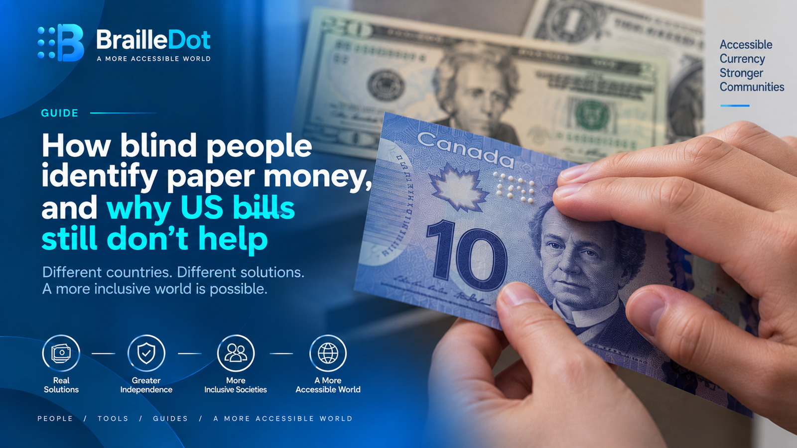
Canadian banknotes carry a genuine set of raised braille dots in the upper left corner of the note’s face, indicating the bill’s denomination directly. The feature wasn’t an anonymous government decision either. It was suggested by Bruno Thériault, an administrator at the Canadian National Institute for the Blind, and the actual design was worked out by Susan Lederman, a psychology professor at Queen’s University with expertise in touch perception. That’s a rare thing to be able to say about a national currency feature, a specific tactile design credited to 2 named people who worked the problem out deliberately, rather than a generic accessibility add-on nobody can point to a source for.
Other countries solved the same problem in different ways
The Netherlands produced the first tactile banknote anywhere in the world back in 1971, well before most other countries treated this as something worth solving. Euro banknotes took yet another approach, designed with direct input from blind organizations from the start, using a straightforward rule where bill size scales with value, larger notes for larger amounts, combined with raised intaglio printing that creates a texture a finger can feel. The highest-value Euro notes, the 200 and 500, carry additional distinct tactile marks specifically because mistaking a very large bill for a smaller one carries real financial consequences. Brazil and Bahrain each developed their own tactile marks that don’t resemble braille dots at all, a different symbol system serving the same basic purpose. Japan uses distinct intaglio marks combined with a different physical size for each denomination. Nearly every major currency in active use today has settled on some combination of these approaches. The US dollar remains an outlier specifically for having none of them.
The US Treasury lost a lawsuit over this in 2008
In 2002, the American Council of the Blind sued the US Treasury directly over this. The case, American Council of the Blind v. Paulson, reached the US Court of Appeals for the District of Columbia, which ruled in May 2008 that the Treasury Department had violated Section 504 of the Rehabilitation Act of 1973 by issuing currency that people with visual impairments couldn’t reliably identify on their own. The Treasury tried arguing that fixing the problem would be an undue financial burden, and the court rejected that defense specifically, finding that Treasury hadn’t actually substantiated its own claims about cost or about the durability problems it said tactile features would cause.
What was promised, and how little of it has actually happened
None of this started with the 2008 ruling. As early as the beginning of the 1960s, the Bureau of Engraving and Printing had already invited blind and visually impaired people to submit comments on how US currency could be made identifiable, decades before the lawsuit that eventually forced action. Congress introduced resolutions urging the Treasury and the Bureau to add braille or tactile markings to US currency repeatedly from the 1970s through the 1990s, and in 1983 the Bureau actually conducted a formal study, working with the Federal Reserve and the Secret Service, looking at how other countries around the world had approached the same problem. After the 2008 ruling forced the issue legally, the Treasury laid out a 3-part response, developing a raised tactile feature for the next full currency redesign, adding large, high-contrast numerals and distinct colors to each denomination in the meantime, and launching a Supplemental Currency Reader Program to distribute free electronic currency-identifying devices to blind and visually impaired people. The high-contrast numerals happened. A formal, dated commitment to the raised tactile feature itself still hasn’t, more than 15 years after the ruling that established it was legally required, and current reporting on the subject still describes it as something planned for a future redesign with no announced date.
What blind Americans actually do in the meantime
None of this stops people from managing their own money day to day, it just means the workaround falls on the individual rather than the currency itself. Folding different denominations in different specific ways, keeping them separated into different pockets or sections of a wallet, and simply asking whoever hands over a bill to state its value out loud are all long-standing, ordinary practices, not workarounds anyone considers unusual within the blind community. Free tools exist too, the Bureau of Engraving and Printing’s own EyeNote app identifies denominations through a phone camera, and general-purpose visual assistance apps serve the same function alongside their other uses. A product called the Click Pocket takes a more direct route, physically adding a braille marker onto the edge of an existing bill after the fact, effectively building the feature currency issuers around the world have already put on their own notes, just applied by hand, 1 bill at a time, instead of printed at the source.
Where braille fits into the bigger accessibility picture
Currency identification and braille translation solve different accessibility problems. A tactile denomination mark helps someone identify a physical banknote, while literary braille represents written language that can be read or produced independently. Our braille translator handles English text in grade 1 and grade 2 UEB, which is a separate use of tactile information from the physical features used to distinguish paper money.
Translate English text into braille
Currency markings help with identifying banknotes, while literary braille makes written language accessible. Convert English text into grade 1 or grade 2 UEB with our braille translator.
Open the translator