How tactile graphics let blind readers read maps and diagrams
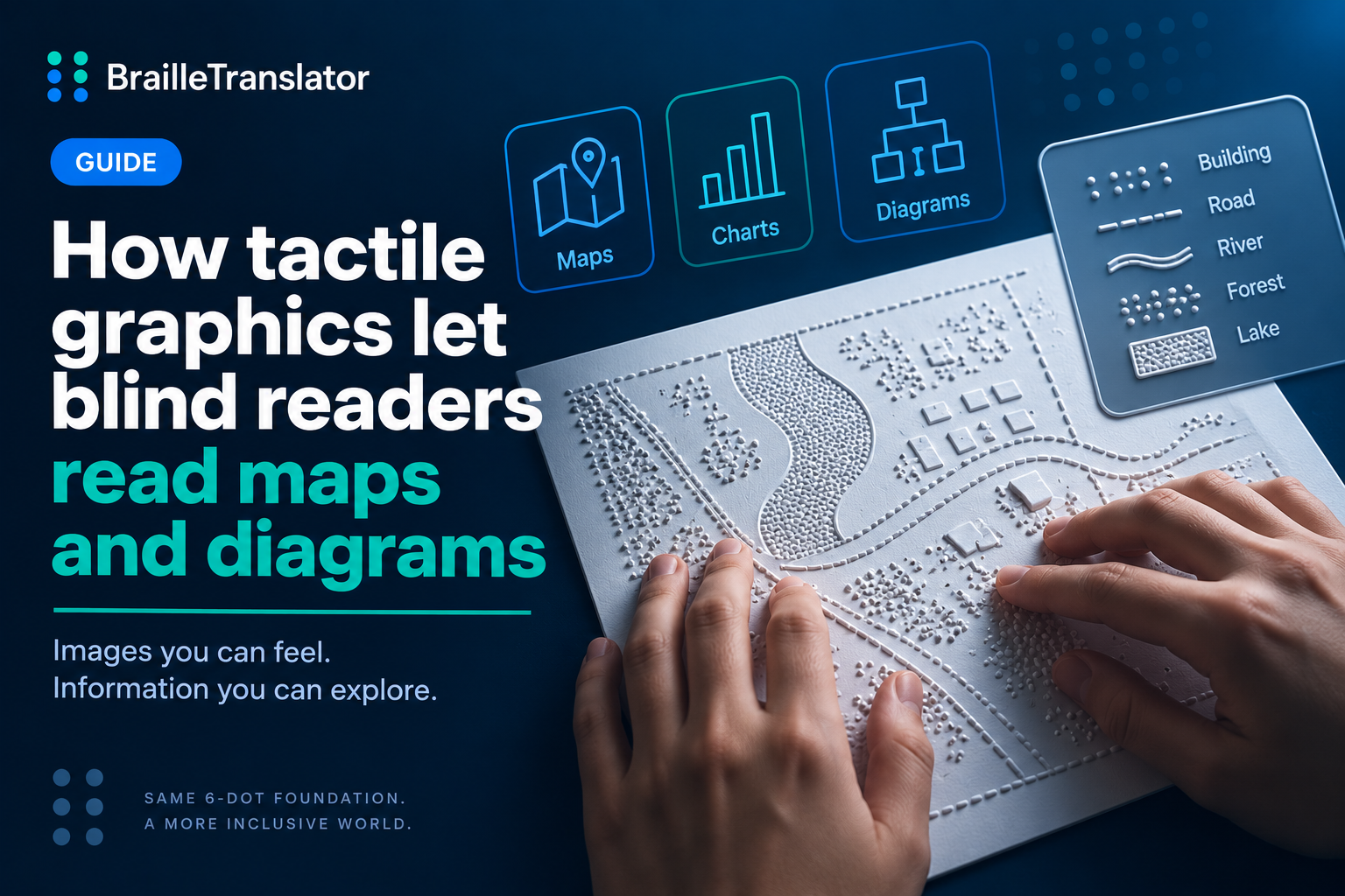
A tactile graphic is a raised, touchable version of a printed image, map, chart, or diagram, but it isn’t simply a picture converted to texture. A real, official standard, jointly developed by the Braille Authority of North America and the Canadian Braille Authority, first published in 2010 and revised in 2022, governs how these get designed and produced. That governance exists because a printed image simplified carelessly for touch doesn’t just look worse, it becomes genuinely unreadable, in a way a slightly blurry printed picture never would be for a sighted viewer.
Not every image becomes a tactile graphic
The governing standard doesn’t start from the assumption that every printed image deserves a tactile version. Its very first section is specifically about criteria for including a tactile graphic at all, real, documented guidance for deciding when a raised image actually serves a reader better than a text description would. A complex chart that mainly repeats information already stated in the surrounding text might not need a tactile version at all. This matters because producing a tactile graphic takes real time and material, and a poorly justified one adds effort without adding understanding.
Complex images get systematically simplified, not just shrunk
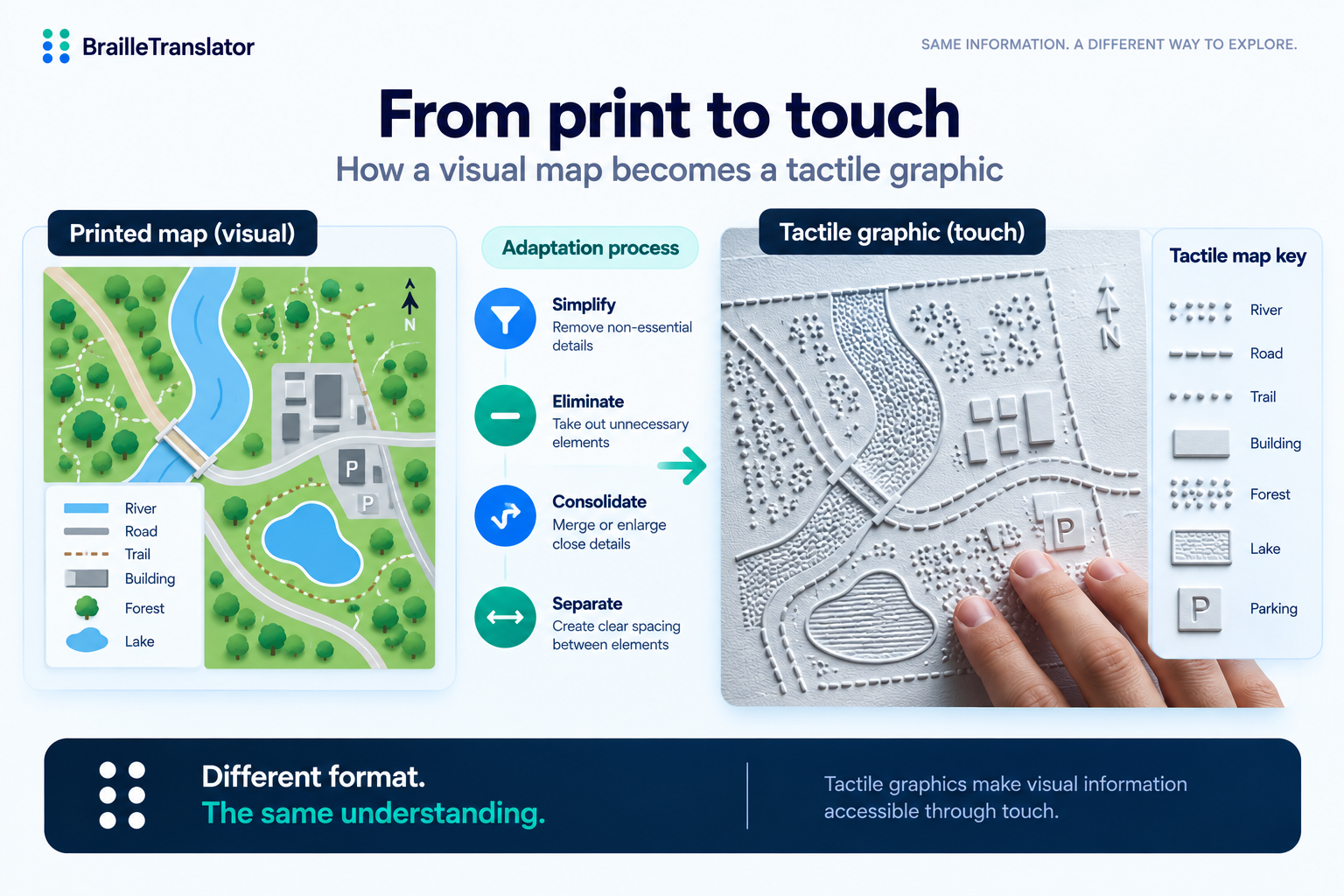
When a graphic is worth producing, the standard defines specific, named techniques for adapting it, not a vague instruction to “make it simpler.” Simplification means stripping out visual detail that doesn’t carry real information, decorative shading, unnecessary gridlines, anything a finger doesn’t need to understand the image. Elimination goes further, removing entire elements from the original if they aren’t essential to what the graphic is meant to convey. Consolidation and distortion is the one that surprises people most, deliberately exaggerating or merging details that sit too close together in the print original to be told apart by touch, intentionally inaccurate to the print version in order to be genuinely readable in the tactile one. Separation does the opposite where needed, pulling apart print elements that overlap or sit too close together, so they don’t collapse into a single confused patch of texture under a fingertip. All 4 of these are real, defined techniques from the governing standard’s own planning and editing guidance, not general design advice loosely applied to touch.
How a tactile graphic actually gets physically produced
The most common production method in schools is swell paper, sometimes called microcapsule or capsule paper. The paper itself is embedded with tiny alcohol-filled capsules, and when a printed image on that paper passes through a heat source, the dark, ink-covered areas absorb more heat and cause the capsules beneath them to expand, physically rising above the surface of the page while the untouched areas stay flat. It’s fast and inexpensive, which is why it’s the go-to method for everyday classroom material.
Thermoform, or vacuum forming, is a more durable alternative. A heated sheet of plastic gets vacuum-pressed over a physical master, a mold built up by hand using cut paper, cardboard, wire, string, sandpaper, or other real textured materials arranged and glued into the actual shape being represented. That master can then be reused to produce identical copies repeatedly, trading the speed of swell paper for durability and consistency across multiple copies. Specialized tactile embossers exist too, printing raised graphics directly and digitally without a separate heating step at all.
None of this is left to individual improvisation, either. The governing standard includes a documented texture palette specifically for microcapsule paper and standardized line styles, so a dashed line reliably feels different from a solid or dotted one across different producers and different materials, the same predictable distinction every time rather than something a reader has to relearn with each new graphic.
Maps get their own dedicated standard within the standard
Tactile maps, the kind used for real-world navigation and orientation rather than classroom diagrams, get their own dedicated section in the governing standard, distinct from general graphics. There’s a documented standard key for maps specifically, the tactile equivalent of a legend on a printed map, standardized nationally rather than invented fresh by whoever produces a given map. That consistency matters more for a map than almost any other kind of graphic, since a reader relying on a tactile map to navigate an unfamiliar space needs the symbols to mean the same thing every time, not just within 1 document but across every map they’ll ever encounter.
This shows up on real standardized tests, not just textbooks
The governing standard specifically addresses tactile graphics on standardized tests as its own topic. That’s a genuinely real-world detail worth sitting with, blind students encounter tactile graphics under actual exam conditions, not only in relaxed classroom settings, which is exactly why consistency and quality control matter enough to warrant their own dedicated section in an official standard rather than being left to individual transcriber judgment.
Why this is a separate skill from reading braille text
Reading a tactile graphic isn’t the same skill as reading braille text, even for someone who reads braille fluently. Text is linear, 1 cell following the next in a predictable sequence. A tactile graphic has no fixed reading order, understanding it requires systematic exploration, hands moving methodically across the page to build a mental picture the way sighted vision takes in an entire image at a glance. That’s a genuinely separate, trained skill, which is part of why the governing standard dedicates specific guidance to graphics for early grades, teaching this kind of systematic reading is its own component of a blind student’s education, distinct from learning to read braille text itself.
What this means for a text translator like this one
This translator converts English text into braille, grade 1 or grade 2. It doesn’t produce tactile graphics, which is a genuinely separate production process involving physical materials, heat, or specialized embossing hardware rather than character-by-character text translation. If you’re working with an image, map, or diagram specifically, that’s a different kind of specialized production entirely. For the text itself, our braille translator handles that directly.
Try the text translator this site actually provides
Convert English text into literary braille with our braille translator, while keeping in mind that tactile graphics require a separate physical production process.
Open the translatorFrequently asked questions
No. The governing standard specifically addresses criteria for deciding when a tactile graphic is actually warranted, since producing one takes real time and material, and a poorly justified one adds effort without adding understanding.
Swell paper, also called microcapsule paper, contains tiny alcohol-filled capsules that expand when heated. Printed dark areas absorb more heat and rise above the page’s surface, creating a raised, touchable version of the printed image.
Yes. The Braille Authority of North America and the Canadian Braille Authority jointly maintain a governing standard, first published in 2010 and revised in 2022, covering design, production, and quality control for tactile graphics.
Yes. The governing standard includes a documented standard key for maps specifically, so symbols mean the same thing across different maps and different producers, similar to how a printed map legend works, but standardized nationally.
No. This translator converts English text into braille. Tactile graphics are produced through a separate process involving physical materials or specialized embossing hardware, not text translation.