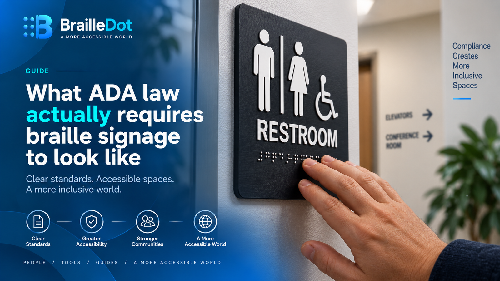
What ADA law actually requires braille signage to look like
A restroom sign has to carry braille under federal law. The sign pointing toward that restroom from down the hallway generally doesn’t. That distinction trips people up constantly, and it’s the first thing worth getting right before looking at the physical specifications themselves, which are precise enough that a sign can look reasonable to the eye and still fail to meet code.
Which signs actually need braille
The requirement applies specifically to permanent room identification signs, restrooms, exits, room numbers, and similar fixed labels meant to stay in place indefinitely. Directional and informational signs, the kind pointing toward a department or listing a building directory, are exempt. So are temporary signs, defined as anything posted for 7 days or fewer. A sign announcing a meeting happening down the hall this afternoon doesn’t need braille. The permanent sign on that same room’s door does.
The braille itself has to be Grade 2, and the standard has moved on since some guides were written
Signage braille must be contracted, Grade 2, the same system covered in our own grade 1 vs grade 2 guide, not the uncontracted, letter-by-letter grade 1 version. Some compliance guides describe the governing standard as English Braille American Edition, which was the code in place before 2016. As covered in our piece on UEB replacing EBAE, that code was declared obsolete once Unified English Braille became the official US standard, so signage produced or evaluated today should be following current UEB contraction rules rather than the retired code some older or less careful guides still reference by name.
The physical dimensions are specific enough to fail a visual inspection alone
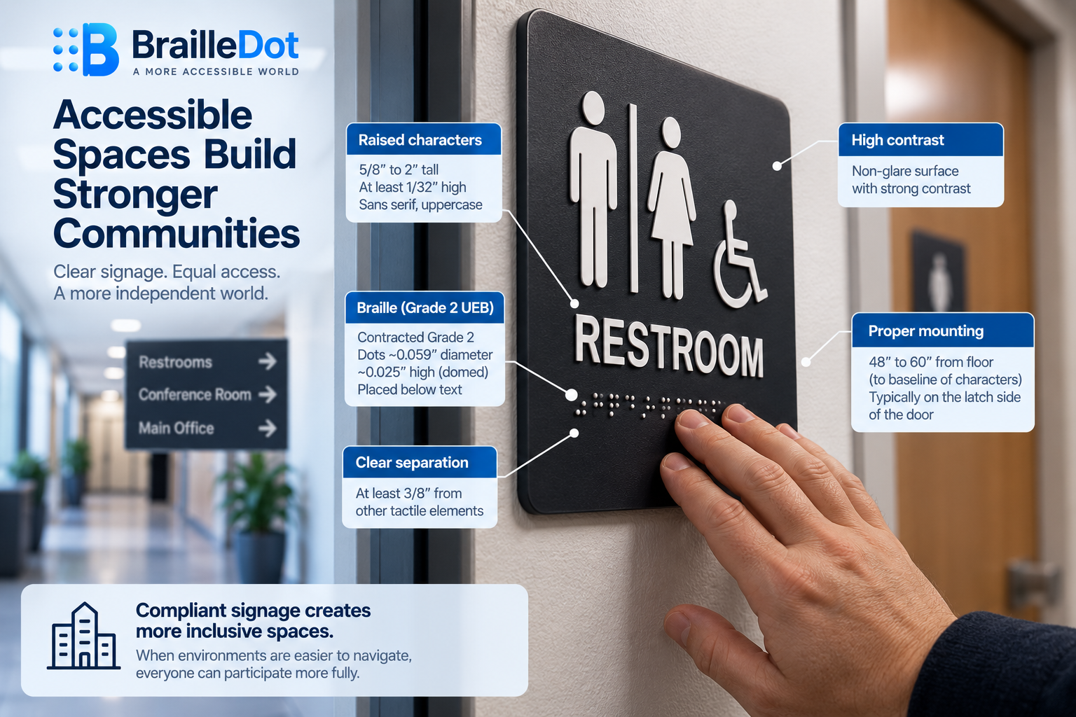
Raised characters accompanying the braille have to stand between 5/8 inch and 2 inches tall and rise at least 1/32 inch above the sign’s background. The braille dots themselves have their own precise dimensions, roughly 0.059 inches in diameter and protruding about 0.025 inches from the surface, and they have to be domed or rounded rather than flat-topped, both for accurate tactile reading and specifically to avoid sharp edges that could injure a finger during use. Braille has to sit directly below its corresponding raised text, or below the entire text block if the message spans multiple lines, with at least 3/8 inch of separation from any other tactile element, raised border, or decorative feature on the sign, enough clear space that adjacent elements don’t blur together under a fingertip.
Capitalization on a sign follows the same rule already covered on this site
The case convention required for ADA signage braille is the identical rule our piece on reading braille dots already covers for UEB generally, lowercase by default, with a capital indicator used only before the first word of a sentence, a proper noun or name, an individual letter, an initial, or an acronym. A sign isn’t given special braille formatting rules of its own here, it follows the same capitalization logic as any other properly transcribed UEB text.
The raised lettering has its own separate set of rules
Braille dots aren’t the only tactile element regulated here. The raised characters printed above the braille have their own font requirements, sans serif only, no italic, oblique, script, or otherwise decorative styling, and uppercase specifically. Character proportions are regulated too, the width of a character generally needs to fall between roughly 3/5 and the full height of the letter, with stroke thickness running somewhere between about a tenth and a third of the character’s height, tight enough tolerances that an unusual or heavily stylized font can fail compliance even if it looks perfectly legible to a sighted reader glancing at it. Spacing between adjacent characters has to fall within a similarly defined range, and for signs with multiple lines of text, line spacing is regulated too, all specifically to keep tactile reading consistent regardless of which sign in a building someone happens to be touching. On top of the tactile requirements, the sign’s visual finish also has rules of its own, a non-glare surface and strong contrast between the characters and their background, aimed at the separate population of readers who rely on sight rather than touch to read the same sign.
Where a sign actually gets mounted, and why the range exists
Mounting height requirements call for the braille and raised text to sit between 48 and 60 inches from the floor, measured to the baseline of the characters. That range, rather than a single fixed height, exists specifically so signs of different physical sizes can still line up on a consistent visual plane across a building, a small sign and a larger one can both comply while still looking coordinated at a glance. Signs generally belong on the latch side of a door rather than the hinge side, positioned clear of anything that would physically obstruct a hand reaching to read it, though elevators are handled under their own separate placement rule rather than this general one.
What this costs in practice
Compliant signs typically run somewhere between $20 and $150 each depending on material, size, and design complexity, a modest per-unit cost that adds up quickly across every permanent room in a larger building. What actually causes signs to fail inspection usually isn’t the price point or the material, it’s getting 1 of the precise details wrong, contractions that don’t follow current UEB rules, dots that sit flat instead of domed, or a mounting height a few inches outside the required range, any of which can mean a sign that looks entirely reasonable still doesn’t meet code.
Use the same UEB system for the text itself
If you’re preparing English text that will ultimately appear in a compliant braille sign, our braille translator can convert English into Grade 1 or Grade 2 UEB. The translator handles the text conversion itself, while the physical signage requirements covered above determine how that braille and its accompanying raised lettering must be produced and installed.
Translate English into UEB braille
Convert English text into Grade 1 or Grade 2 UEB with our braille translator, then use the translated text when preparing accessible materials or signage.
Open the translator